How to Build a SaaS Landing Page That Converts
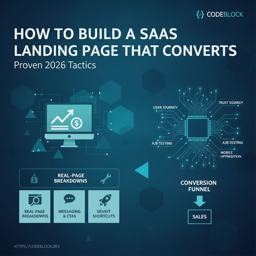
Your landing page is the single highest-leverage page in your SaaS. Done right, it is your silent sales team: attracting qualified leads, converting them, and earning trust—all in one scroll. In 2026’s hyper-competitive SaaS world, most landing pages are pretty but ineffective. Here’s how to build one that actually wins customers, not just traffic.
Why a Landing Page Matters in SaaS
- First impressions: You have seconds to prove relevance, trust, and value.
- Revenue driver: Even a 1–2% increase in conversion (visitor → sign-up → trial → paid) can double your MRR.
- Testing lab: Fast-moving SaaS teams treat their landing as an experiment hub, refining copy, layout, and CTAs for conversions, not just prettiness.
Anatomy of a High-Converting SaaS Landing Page
1. Headline and Subhead
- Instantly tells the user what your product IS and what VALUE it brings. Clarity > “smart” copy.
2. Hero CTA and Visual
- Single, clear call-to-action above the fold (“Try for Free”, “Get a Demo”)
- Product image or short demo animation—what does the product do?
3. Core Benefits—not just Features
- Use short, bold statements: “Onboard users in 5 minutes,” “99.9% uptime: sleep easy”
- Solve specific pains ("Automated invoices, not more spreadsheet hell")
4. Trust Signals
- Testimonials, customer logos, press badges
- Verified reviews with short, photo-backed statements are gold
5. Product Screenshots or Demo Video
- Show the product in-action. Gifs, 30-sec screencaps, or interactive product tours
6. Pricing/Plans
- Simple, visible, above-the-fold (even if "contact sales" for enterprise—with a "starting at" range)
- Avoid hiding price: more trust, fewer drop-offs
7. Social Proof and FAQ
- List the best validation: transparent feature comparison, recent reviews, quick-access FAQs (“How secure is my data?” “What’s your refund policy?”)
8. Secondary CTAs Throughout
- Don’t just have one signup button—embed clear CTAs throughout the scroll
Content and Messaging Tactics for 2026
- Clarity and speed: Short sentences, bolding, big headlines
- Visual hierarchy: Lead the eye with whitespace, font size, colored accents around CTAs, and anchor links
- Authenticity: Real user photos, non-stock screenshots, founder faces, trusted partner mentions
- Strong microcopy: Button labels, benefit subheads, error/help messages written to reduce fear
Examples:
- Weak: “Unlimited power for your workflow”
- Strong: “Generate 50 invoices in seconds—no spreadsheet headaches”
- Weak: “Get started”
- Strong: “Try free, no credit card”
Design, UX, and Mobile
- Design for mobile first: 2026 traffic is >60% mobile for most SaaS
- Contrast and color: Make CTAs obvious.
- Pacing: Modulate section depth, break up content with visuals and testimonials
- Load speed: Under 2 seconds. Optimize images, fonts, JS.
SEO and Performance
- Use one
<h1>, keyword-rich page title/meta; avoid over-stuffing - Use structured data (FAQ, review, product schemas) for Google rich results
- Preload/preconnect analytics—don’t block load
Testing, Analytics, and CRO (Conversion Rate Optimization)
- Install analytics (GA4, Plausible, Mixpanel)
- Track and A/B test above-the-fold CTAs, headline, testimonials, hero image
- Optimize for low-bounce, deep scroll, and “signup goal” completions
- Set up event tracking: clicks, video views, scroll depth, form fails
Implementation (Web/React/Blazor/etc)
- Keep landing pages independent of app auth code for fast deployment
- Use reusable hero, feature, FAQ, and testimonial components
- Load only what’s necessary—no slow dashboards/scripts
DevKit: Launch Landings Fast (and Keep Iterating)
CodeBlock DevKit includes:
- Modern, conversion-optimized landing modules (hero, features, testimonials, FAQ)
- Analytics-ready CTA blocks
- Full SEO/meta support
- Built-in responsiveness and rapid deployment
- Example sites to fork and iterate as new features or offers launch
Complete SaaS Landing Page Checklist
- Keyword-rich title, meta,
<h1>and rich schema data - Clear headline, tested CTA, product visual above fold
- Trust signals—testimonials/logos—near scroll start
- Visible pricing/plans
- Social proof AND objection-handling microcopy
- Performance: <2s load, mobile-first design
- Multiple, clear CTAs throughout
- Analytics wired and tested (each signup form goal tracked)
- Fast-to-edit: content and UX can be changed without full deploy